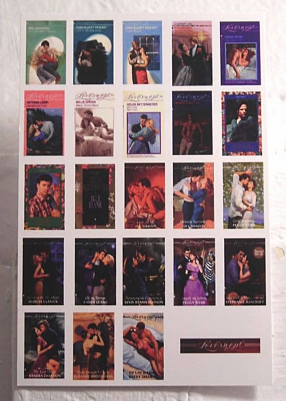
 Magnet #477 - Loveswepts
...by authors you'll always remember."
- Loveswept tagline
So yeah, did ya'll think I was going to magnetpost on Harlequin, and not give equal time for something better?
Yes, my beloved Loveswepts. People get annoyed with me because I hold grudges longer than most, and this Loveswept thing is no different.
When I was in seventh grade, I wrote a letter to the editorial director of Loveswept, asking her how do I become an editor, and get to do what they do. After all, these were the women who were producing the books that I was hoarding my lunch money and spare change to buy. They were the ones writing the Editors Corner in all the books, where they told me what was coming up the next month. I felt like I knew these women.
The letter went unanswered.
A decade or so later, I was working alongside them. A dream come true.
So when The Powers That Be made the awful decision not to support the imprint any further, choosing to kill my Loveswepts, it completely messed me up. I mean, when you get your dream job when you're 24, only to have it ripped from you (via E-mail no less, thank you, Roger Cooper), you sort of say screw it, and them. I was soured on the industry, and so I left.
But, enough about that.
One of my most favorite job responsibilities ever was working with our Loveswept authors on their cover art. (Actually, my favorite thing was being able to chat with authors I'd grown up with, but anyway.) I wrote up a little questionnaire for them, and called them and we'd get to discuss their characters and hot boys, and who to cast as their hero and heroine.
In fact, look closer on this magnet I made, particularly the bottom rows. John F. Kennedy, Jr. and George Clooney. Julia Roberts and Demi Moore.
But beyond looking at model portfolios and headshots, there was the extreme pleasure working with the actual artists to come up with a pose and a background. So much fun, watching the art go from roughs to sketches to finished paintings, and then bound book. I used to take special pleasure mailing out the books to the authors, knowing that the second they received them, they'd be calling me squeeing with delight.
It's kinda funny, as I was pulling cover art from various websites to make this magnet you can see the progression in the art, as well as how the cover design adapted to the changing world.
The original cover design from the early 80s with the iconic (shut it, it was) Loveswept wave featured couples in hot clinches, with a sort of gauzy, dreamlike feel to them. Then, as the 80s wore on, we graduated to the more colorful 80s colors, with one specific color each month, framing the different cover art for each book.
Then, they started to experiment with photography, because it was cheaper to use than original paintings. Then, they made a decision (of course, based on economics, and was probably the beginning of the end of my beloved Loveswepts), to drop down to what amounted to headshots of male models in costume.
They weren't received all that well. I mean, really. They were inaccessible hot men, men we can look at in any magazine or tv show. But putting them on covers of our books didn't give us, the reader, any room to imagine. The photos were too literal.
Of course, those male models were infinitely better than their next move, which was to drop cover art altogether, going with some crazy (though pretty) flower border, and making the ultimate faux pas of reusing cropped images our old cover art for the back cover!!! I had authors telling me, yeah, they reused my art for so-and-so's book. Come. On!
But, thankfully, by the time I arrived on the scene, we had gone back to real cover art. The last, too little, too late, desperate push to regain our readers. It probably could have worked, had we just kept going and supported the line a little bit more.
Mind you, for every Harlequin plot I shared in yesterday's magnetpost, there are a dozen or so more Loveswepts that I can remember - the cover art, the heroes, the heroines, the title, the author, and in some cases, the book number. I painted my bedroom at home the color of a Helen Mittermeyer book. I tear up before I get to the good parts of an Iris Johansen title, even when I've read the darn thing a thousand times. I squee whenever I see current books by old authors on the shelves. I cringe whenever I see they've repackaged or beefed up what were already perfectly wonderful books for re-release.
Do the books hold up? Some do, some don't, but they're always as good as I remember...or rather, they tend to transport me back to my bedroom when I would read them one after another, until 3 and 4 in the morning, or begin one in homeroom, and be done in time for dinner.
Eh, but that was ages ago, and only women of a certain age (mine and older) remember those old Loveswepts. It was a grand time for me, remembered mainly for the cover art shenanigans...
Though I've moved on, in the end, all I have to show for those years, reading such wonderful books, is a giant cabinet full of just about every Loveswept ever published. Oh! And a giant stack of gorgeous cover flats, stuffed somewhere deep in my closet.


2 comments:
Loveswept is the reason I started liking Suz Brockmann. And then she started writing the longer books that just aren't as good. Oh! I had that Witchy Woman one with the JFK Jr. lookalike.
Loveswept is how I was introduced to Iris, Kay, Fayrene, and Peggy - both figuratively, and literally. Although, when I met Iris, I was so nervous, I stepped on her foot.
I loved that Witchy Woman cover - the guy was hot. But of the ones I worked on - the Spontaneous Combustion with the firefighter, and the Angels on Zebras with the carousel, were my favorites. Though there are several runners-up. Oh, what the hell, they were *all* my favorite. Except the one where the guy looked like he was a turtle because of his positioning on the bed. Heh.
Post a Comment